Langtons filter
UI designs

Langtons filter
UI designs

Category:

UI Design

Background and problem statement

Background and problem statement

Langtons’ online catalog offers an extensive collection of premium wines, but the previous filter system was clunky and difficult to navigate, especially on mobile.

The goal of the redesign was to streamline product discovery, reduce user frustration, and ensure customers could quickly find wines that matched their needs.

Problem:

On mobile, the filter overlay was cramped and difficult to use on smaller screens.

Desktop filters presented hundreds of wine brands in a dense, overwhelming layout.

Customers struggled to efficiently narrow down options, leading to potential drop-offs.

Opportunity:

Create a more seamless and intuitive filter experience on mobile.

Introduce a structured, searchable layout on desktop to handle large brand lists.

Improve product discovery and browsing engagement across platforms.

Problem:

• Designers had to manually update every banner size individually, leading to inefficiencies.
• Branding inconsistencies arose due to the lack of a centralised template system.
• Adapting banners for different platforms (web, email, social etc) required redundant manual effort.

Opportunity:

• Automate design updates as much as possible to reduce banner creation time.
• Standardise templates to ensure visual consistency across all assets.
• Implement flexible resizing to optimize banners for different sizes and platforms.

User research

User research

Insights from user research highlighted a few key issues:

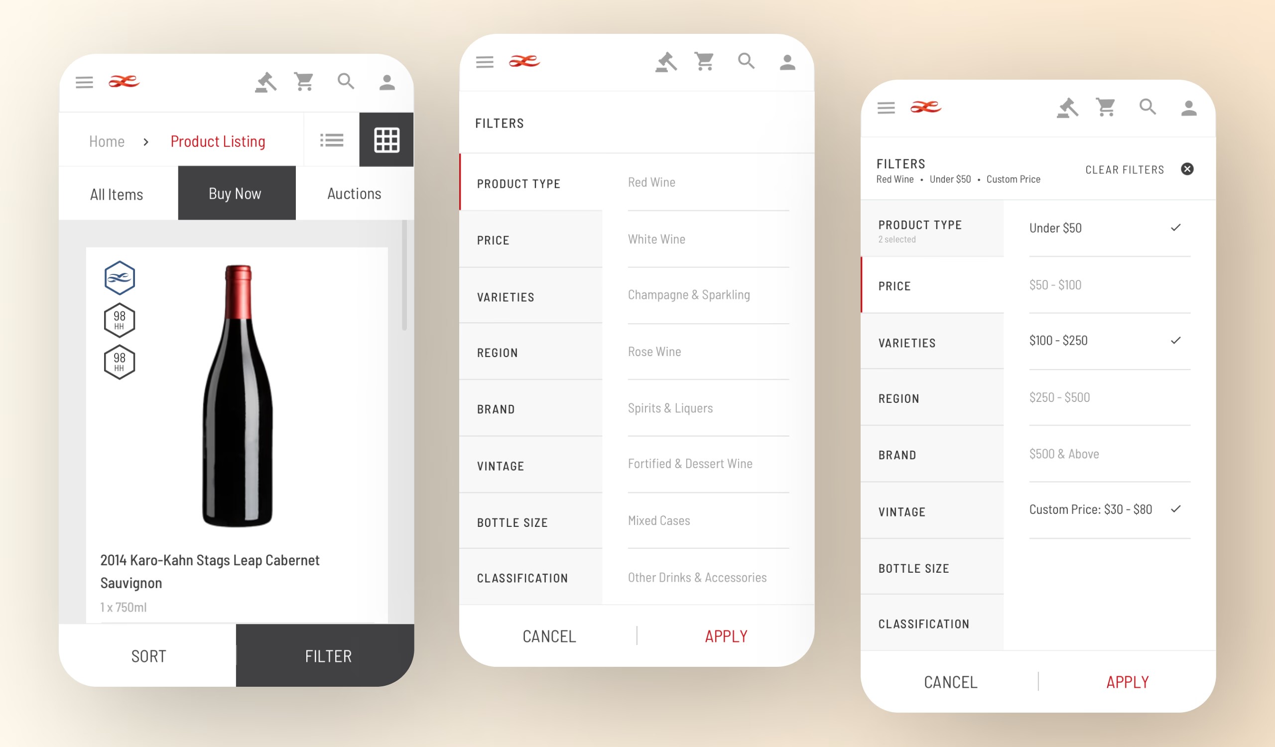
• Mobile filters felt too small and fiddly, discouraging deep browsing.

• Desktop users found it difficult to scan through long lists of brands.

• Customers often abandoned filters if they couldn’t easily find what they needed.

On discussions with marketing, they highlighted that customers filtering successfully were more likely to convert and purchase higher-value wines.

The solution

The solution

To address the issues, I designed two distinct filtering experiences, optimised for device type:

Mobile filter design:

• Introduced a full-screen filter experience, minimising distractions and maximising usability.

Clear category groupings helped users quickly find the right options.

• Users could apply filters in a single action, improving speed and usability.

Rather than opting for a filter that pops out or overlays the screen which can be challenging on small screens, I designed a full-screen filter that gave users the space to engage with the filtering options without feeling constrained.

After selecting their filter preferences, users could apply their settings and return to the product listing page, now customised to their specific needs.

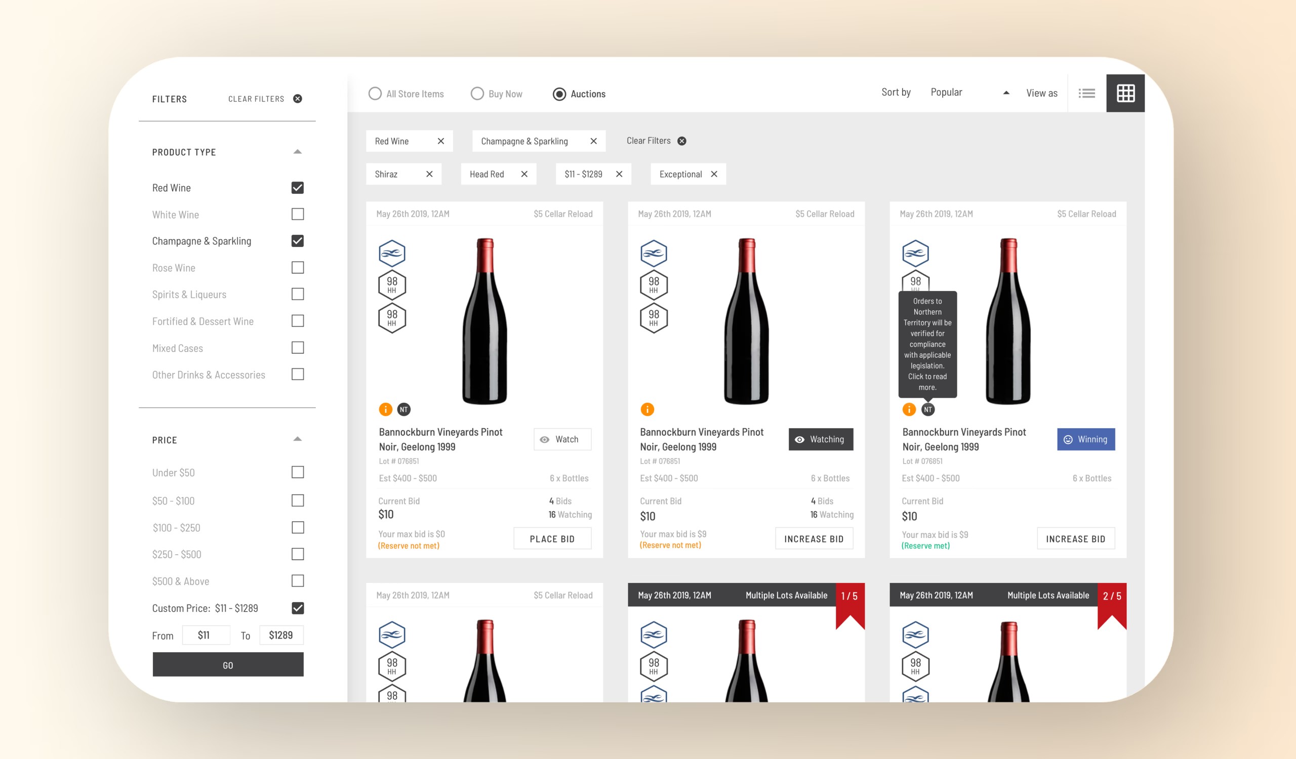
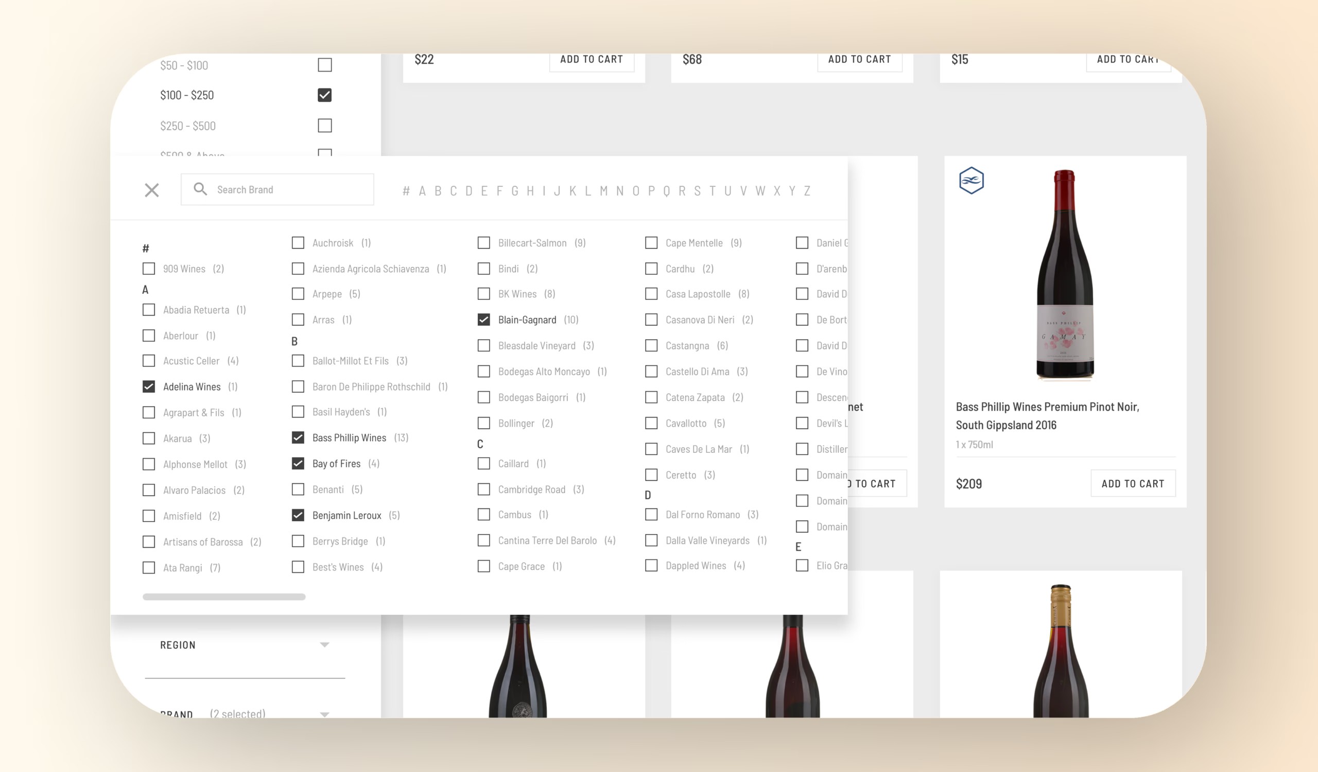
Desktop filter design:

• Designed a large, scrollable side panel to handle hundreds of wine brands without overwhelming users.

• Brands were organised into categorised sections to make scanning easier.

• Introduced a search within filter option to allow direct brand lookups.

For the desktop design, a larger pop out menu was required to present the hundreds of wine brands Langtons offers.

This opened as a large, scrollable section, displaying all the available brands in a categorized and structured format. This provided users with an efficient way to explore Langtons’ vast product offerings without overwhelming them.

Testing and validation

Testing and validation

I conducted internal usability tests with sample users, focusing on ease of use and speed to filter.
Key findings included:

• Users completed filtering tasks 30% faster on mobile

• Fewer errors/misclicks were observed on mobile.

• Positive feedback on the structured, clear layout.

Impact & results

Impact & results

✔️ Enhanced the wine browsing experience for customers across devices.

✔️ Reduced filtering task times by 30% on mobile.

✔️ Improved user satisfaction with both mobile and desktop browsing.

Reflection & next steps

Reflection & next steps

With additional time and a broader business case, I would explore:

• Personalised dynamic filters based on previous user behaviour to further streamline product discovery.

• Saved filter settings could make returning customers’ experiences even faster and more convenient.

Let’s work together.

I'd love to talk about how I can help.
Please feel free to reach out to chat.
Saul Minshall

Follow

LinkedIn

Let’s work together.

I'd love to talk about how I can help. Please feel free to reach out to chat.
Saul Minshall

Follow

LinkedIn

Let’s work together.

I'd love to talk about how I can help. Please feel free to reach out to chat.
Saul Minshall

Follow

LinkedIn

Let’s work together.

I'd love to talk about how I can help. Please feel free to reach out to chat.
Saul Minshall

Follow

LinkedIn